BOYS & GIRLS CLUBS REBRAND
Rebranding Concept Design Project
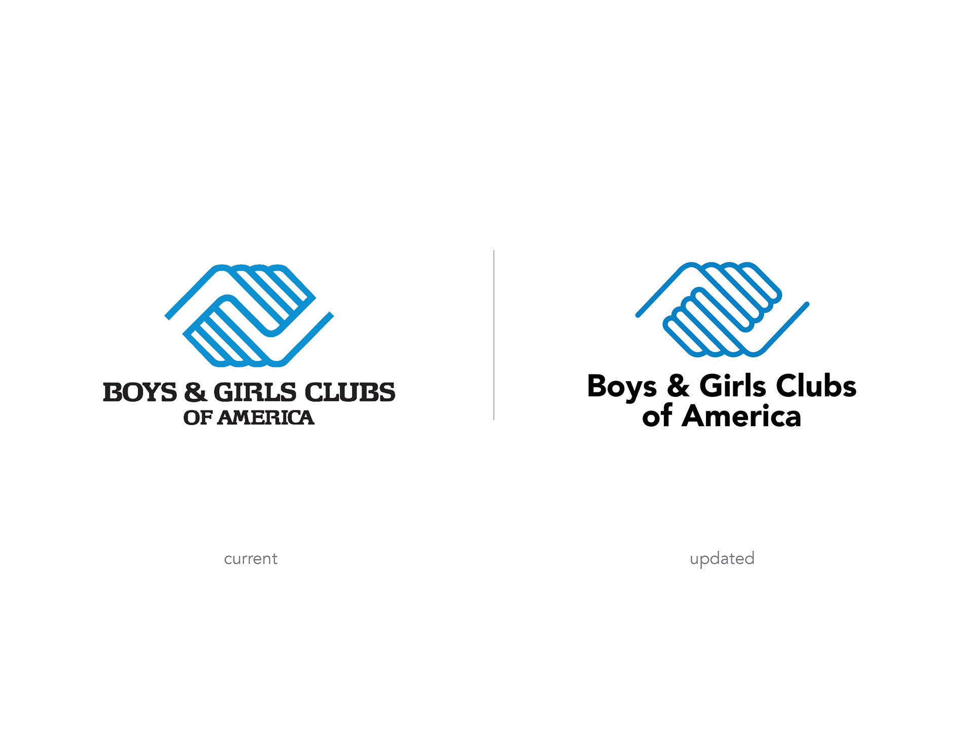
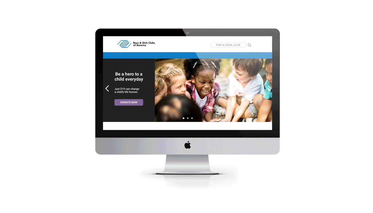
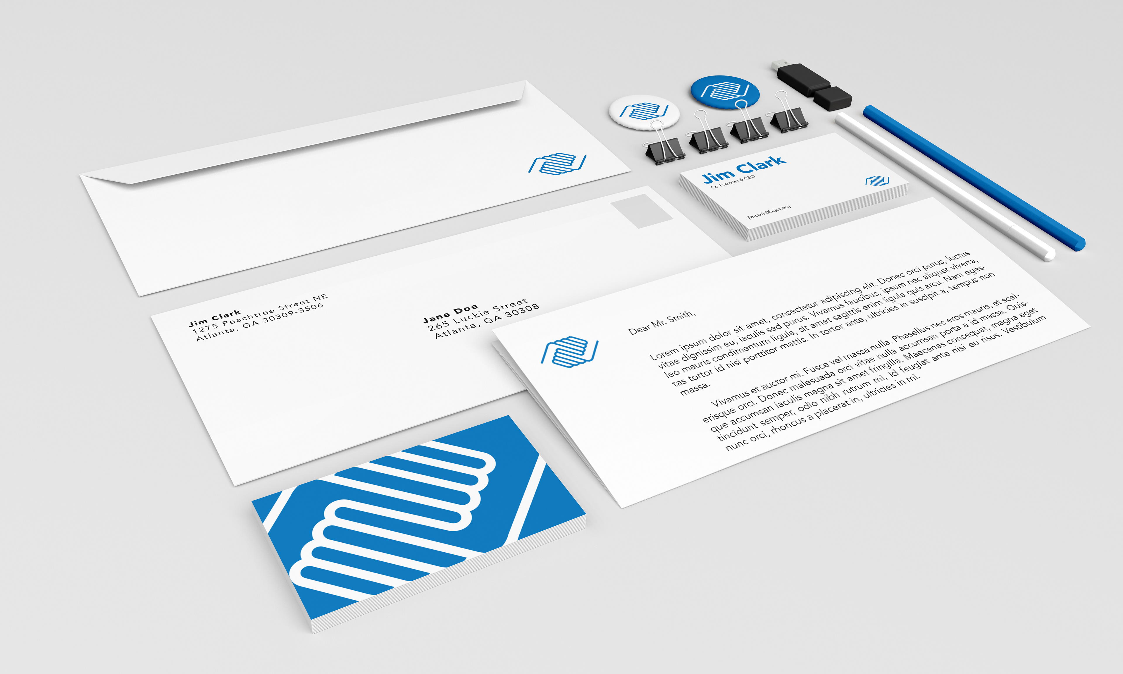
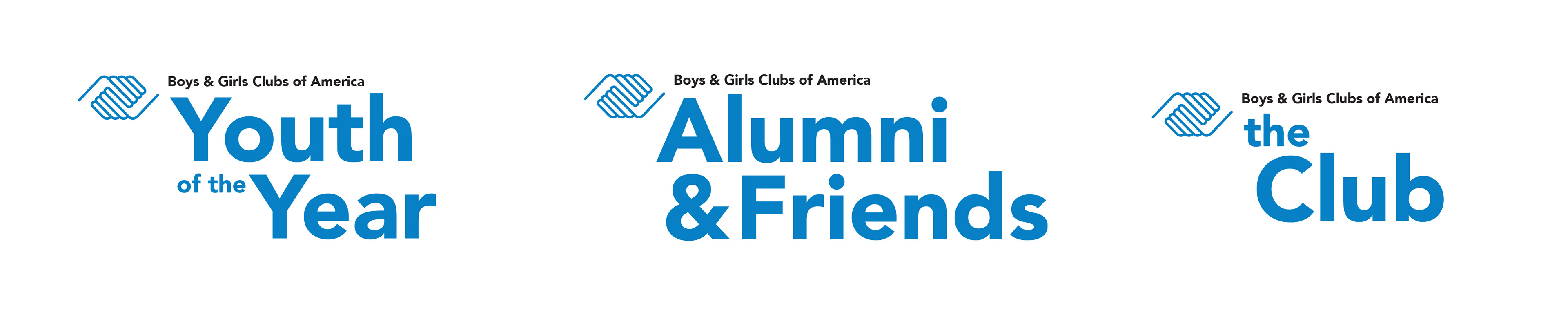
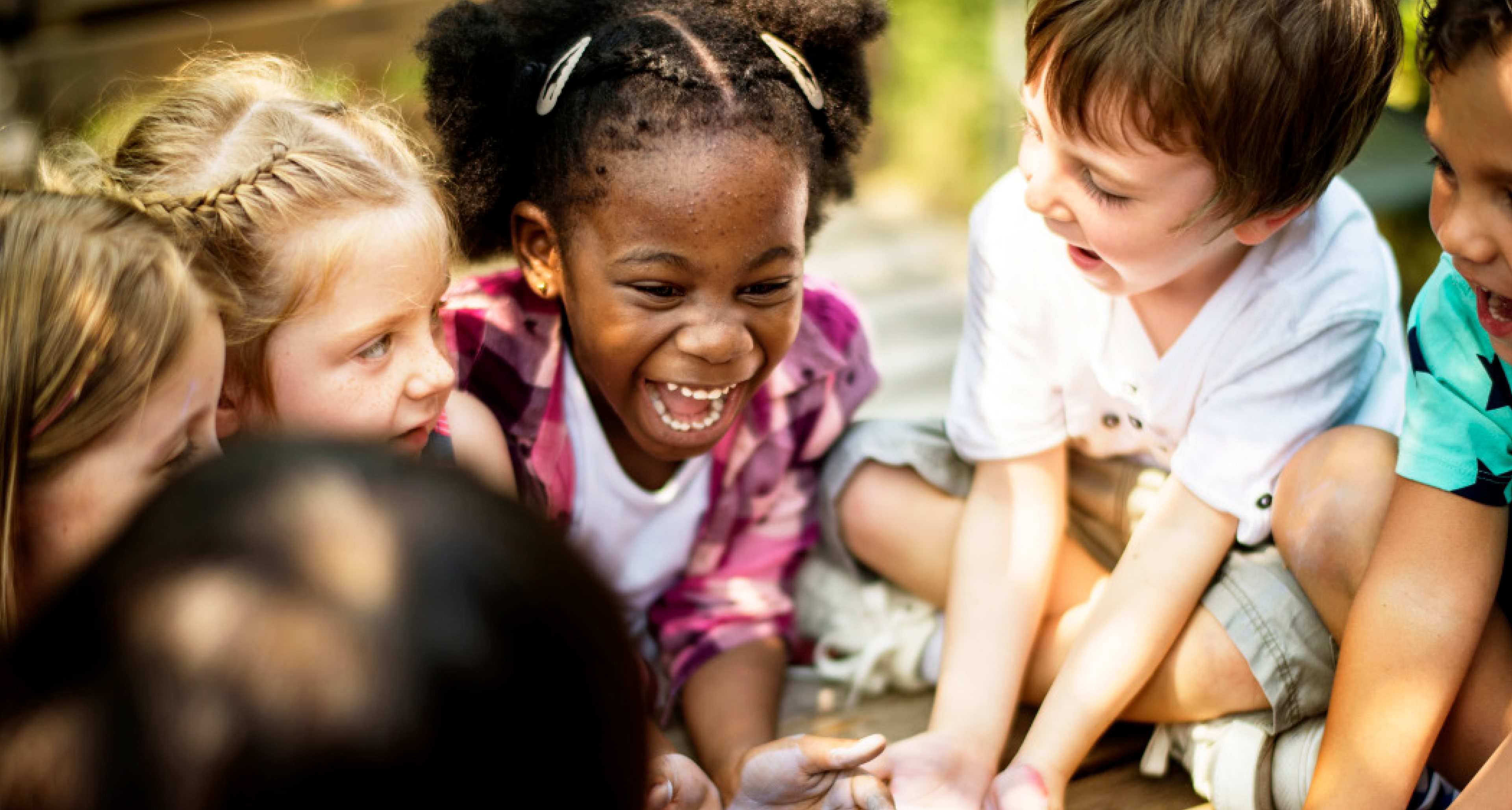
The Boys & Girls Clubs of America is an organization about fun, inclusivity, guidance, safety, dependability, and much more. B&GC offers a safe environment and an experienced staff to help shape children for a better future. When we think about the Boy & Girls Clubs, we associate it with a “holistic” positive space and even a “home away from home.” The current mark depicting two hands grasping each other conveys togetherness, trust, reach, etc.
After research and assessment, I concluded that for this project, it would be most successful to evolve the current brandmark.
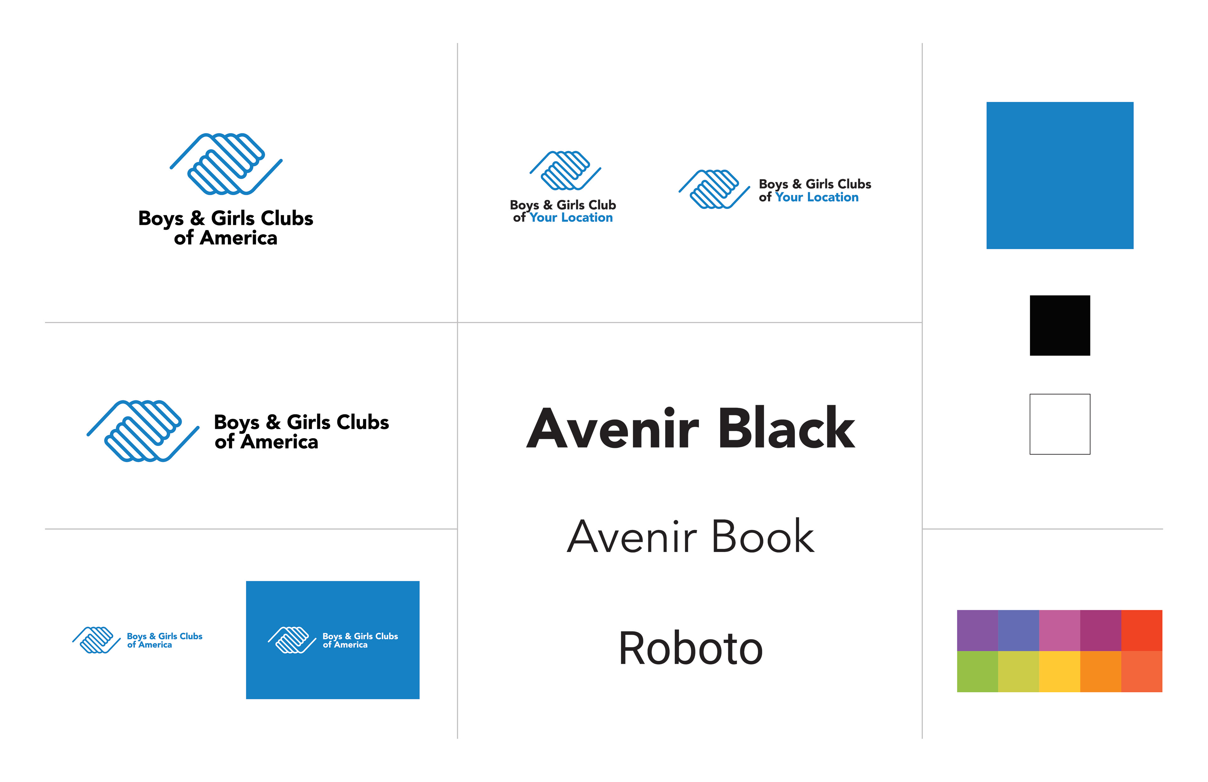
We need to modify the brandmark in a way that does not seem too far off from the recognizable and strong current logo (Saul Bass, 1980) while creating something updated, simple, and effective. The mark should be softened and this would be best accomplished by attempting to make the hands look as if they are connecting more.
This refinement increases the legibility of the hand symbol.